MUSIC POSTER FOLD DESIGN
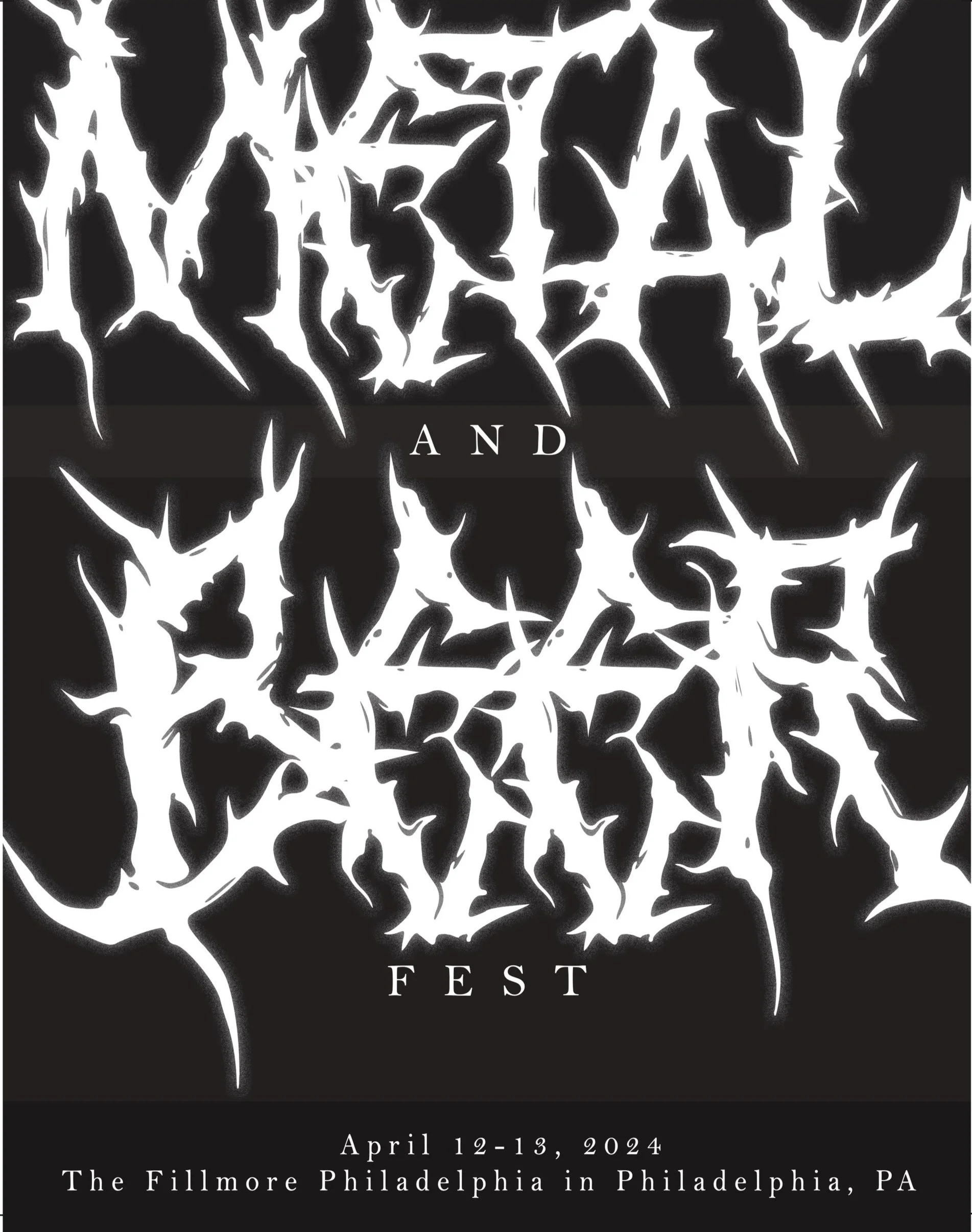
My poster fold showcases a deep understanding of the ‘Metal and Beer’ festival through the use of typography. The contrast between the spiked font and more legible and professional sans-serif font I create a poster that is easy to read while still keeping the aggressive, hard metal atmosphere.In the centerfold of the layout I used a clear composition that allowed the reader to follow along and digest the information about the performers and the beer options, while still staying true to the overwhelming and dark nature of the music itself. To further make the piece legible I used simple text hierarchy on the left hand side of the pamphlet to ensure it was clear about what is happening on each day, then I used the spiked font to distinguish the beer options to keep the viewer’s eyes moving seamlessly.


